It’s time to look at another issue of MAD, and the handy-dandy randomizer spat out the December 1967 issue. Though it was chosen randomly, MAD #115 is a surprisingly interesting issue to talk about, being the source of a few tidbits of trivia. But, beyond that, it’s a strong issue and features a smaller number of longer articles than might be expected from MAD.
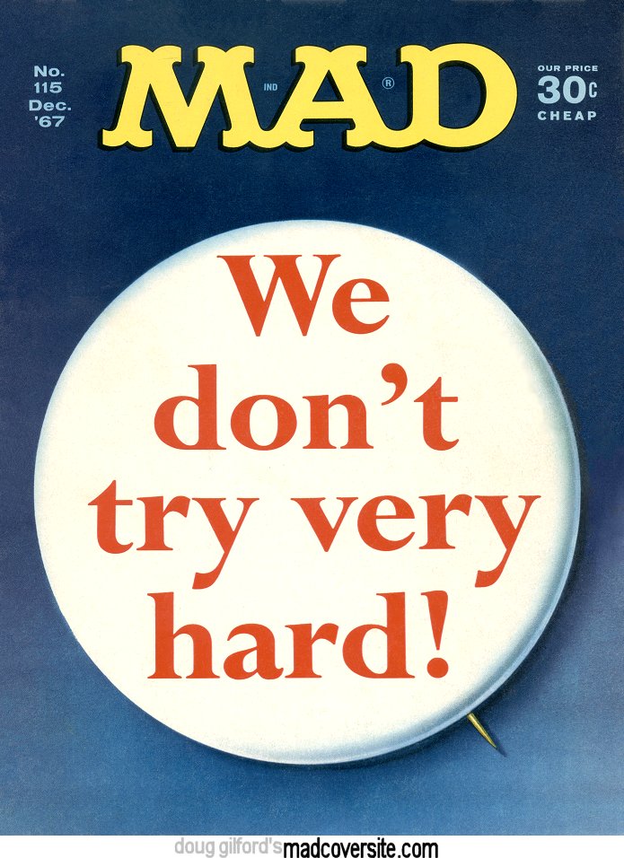
Cover: Normally, a crop of the cover would have been the featured image up above, but, as you might guess, this cover doesn’t crop so well. The cover is a riff on the rental car company Avis’ slogan, “We try harder!” — but more on that later, as it turns out that this cover is actually a teaser for an article.
The art is by Bob Clarke, one of MAD‘s underrated superstar artists, and you might notice something special about this cover. Namely, Alfred E. Neuman’s not on it. MAD #115 was the first cover since MAD #24 to not feature the coverboy, and one of only twelve covers since #24 to not have Alfred’s face — and one of only eight to not feature any representation of him at all.
That said, while it’s interesting from the trivia aspect, it’s also a relatively tame cover. It’s eye-catching with its huge white circle, but a little too simple for my tastes to be one of the truly classic MAD covers.
The inside front cover is just a house ad for the Howling MAD paperback, and the letters column isn’t terribly notable, other than the fact that there’s a long debate about #113’s article “America the Beautiful — Revisited,” and a complete lack of editorial replies to any of the letters. But it does have this adorable subscription ad, featuring Giuseppe Baggi’s origami made from money:
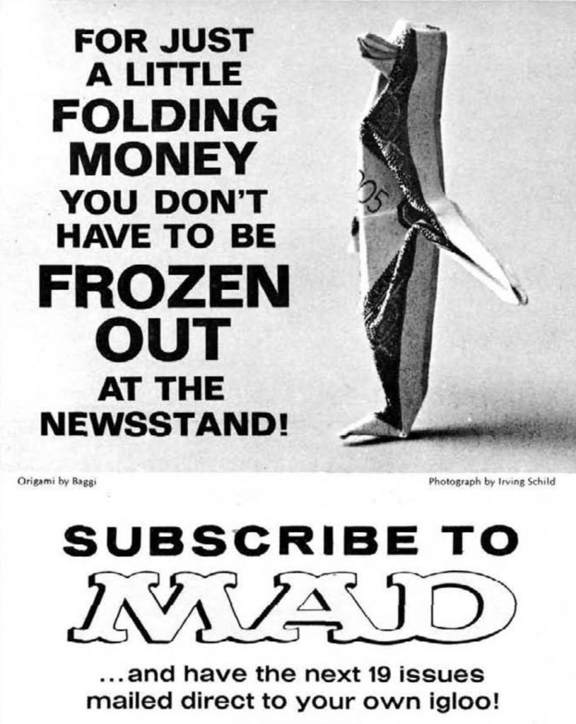 (And, for those curious, a MAD subscription in 1967 cost $5 for 19 issues — cheap!)
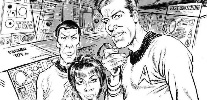
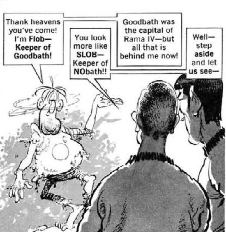
Star Blecch: While usually the MAD movie satire appears as the first actual article, MAD #115 changes it up with their Star Trek parody. (As we’ll see, in terms of cultural impact, MAD made the right decision.) One of Dick DeBartolo‘s classic articles, “Star Blecch” is a clever, funny riff on Star Trek. The spoof is about the Starship Boobyprize discovering that the planet Rama IV, populated by Don Martin-looking creatures, is about to explode.
Mort Drucker’s art is exquisite as always, and DeBartolo’s writing is top notch, loaded with puns and hilarious jokes. (Spook: “That’s what your MIND says! What does your HEART say?” Kook: “Pit-a-pat! Pit-a-pat! Pit-a-pat — just like everybody else’s!”) But one of the most interesting things about this parody is the way the story wraps up — the solution is for the Boobyprize to reverse orbit and go back in time. You might recognize this plot device from the first Superman movie. Somehow DeBartolo ripped it off, despite “Star Blecch” coming out 11 years before the film. No wonder they call him Dick Dastardly! (No one calls him that.)
When The Hertz-Avis Rivalry Really Gets Out Of Hand: If you didn’t guess, this is the article the cover’s teasing. A little bit of ad campaign history first: During the ’60s, the two main rental car companies were Hertz and Avis. (Unlike today when the two man rental car companies are Enterprise and Hertz, with Avis third.) Avis had a successful ad campaign based around the idea of “When you’re No. 2, you try harder.” The campaign was a huge success, and Hertz tried a countering ad. Avis replied with another ad to counter the Hertz ad, and there you have the premise of the article.
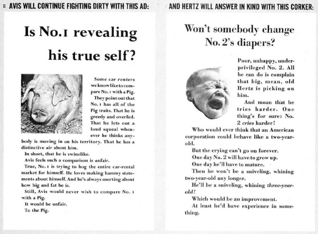
Frank Jacobs’ successfully apes the style of the Hertz/Avis ads, and the escalation is hilarious, ultimately ending with a joint ad declaring that, the rivalry was a complete fabrication. The ad announces Hertz and Avis’ intention to merge, buy out their competitors and then jack the rates up once they have a monopoly.
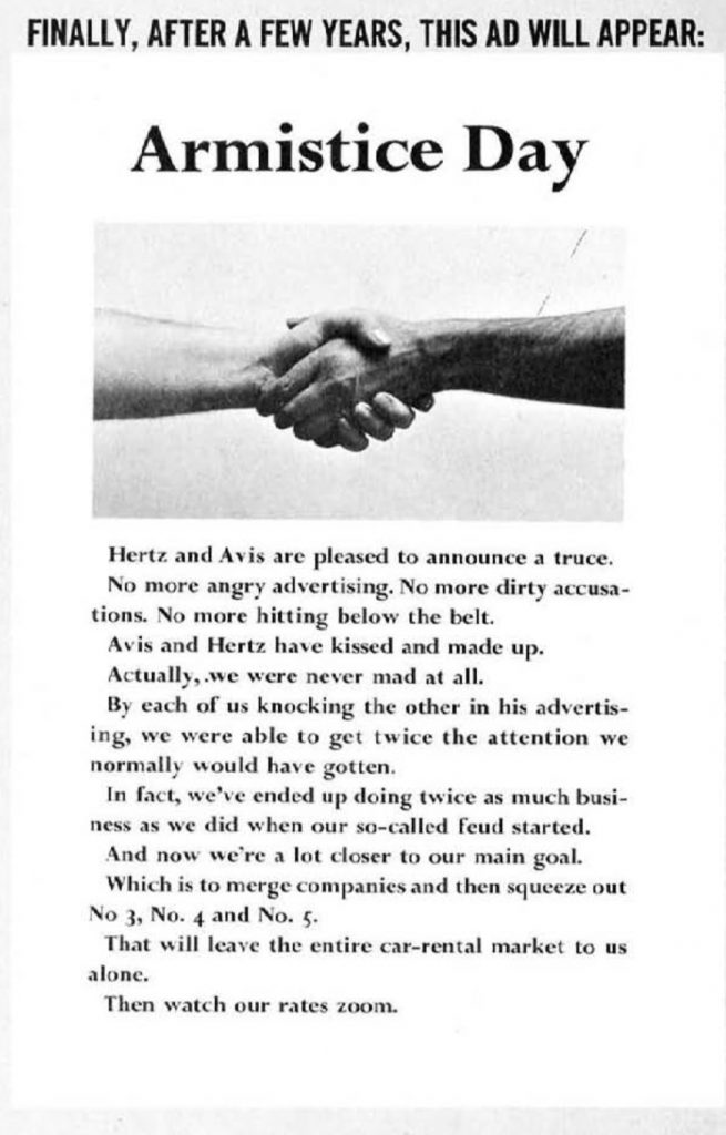
Boy, it’s hilarious what people in 1967 thought was an issue! Sure glad stuff like this never happens these days!
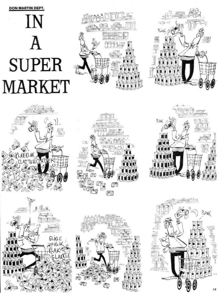
In a Supermarket: MAD #115 is odd in a different way — there aren’t nearly as many of the recurring features. Don Martin only gets one two-page strip, instead of his usual three one-pagers, and, as we’ll see, there’s no Spy Vs. Spy strips either. (Strangely, the second Spy-less issue in a row that we’ve covered!) It’s a good comic, though, and while I’ve left out the punchline, you can probably guess where it’s going. (But that’s not a bad thing; there’s value in a joke well-told, even if you can guess the end.)
TV Coverage of an Off-Year Election: Another Dick DeBartolo piece, and another one where he’s got his crystal ball polished up. Admittedly — it’s a low-key prediction: One of the one-panel characters is named “Tom Petty,” which just happens to share the name of a certain rock star who died way before his time. (I’m referring, of course, to Prince.)
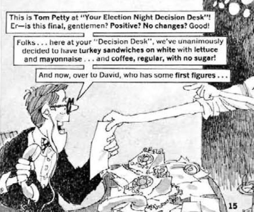
While that’s a surprising and amusing coincidence, DeBartolo satirizes TV news’ desperate attempt to fill up time, a problem that’s only become exacerbated by 24-hour channels. I love how the piece depicts the frantic nature of these kinds of broadcasts though, as the newscasters try to impart excitement to engage the viewer as they report on small races.
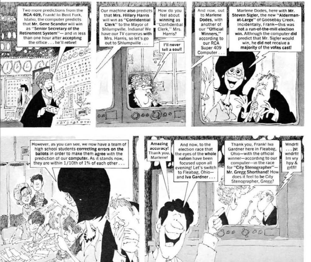
This joke, about changing the ballots to more accurately reflect the polls, also seems strangely prescient. I wonder if DeBartolo ever felt a little like the mythical Cassandra. Though, I suppose, that question could be posed to just about any MAD writer.
MAD Mintlies: A one-page piece by William Garvin and Bob Clarke that, honestly, feels a bit like filler. It’s in the vein of recurring features like “Horrifying Cliches,” where an idiom is made literal. It’s fine, and probably wouldn’t be notable were it not for one entry, the “Three Dollar Bill”:
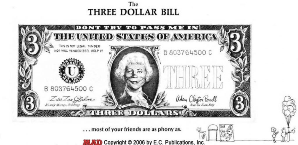
This article ended up being yet another entry in the FBI’s file on MAD. As Mental Floss explains, enterprising fraudsters were cutting the bill out of the magazine and using it in the then-new automatic change machines. The technology wasn’t nearly as advanced as it is now, so despite looking to a human like an obvious fake, the machines weren’t so savvy, and spit out a dollar in change. Given that each issue of MAD was 30 cents, that’s a 70 cent profit.
The Evolution of Dating: As mentioned before, MAD #115 has a smaller number of longer articles than most issues of MAD. This is one of them, a seven-page article by Larry Siegel and George Woodbridge about the history of dating. While it’s a pretty good piece, it really could have been trimmed. The premise is looking at romantic relationships through three eras, 1890-1910, 1930-50 and 1967. While some of the humor relies on stereotypes — including stuff that now would appear in memes like “Are the straights okay?“— it’s surprisingly insightful about how the culture of the past screwed people up.
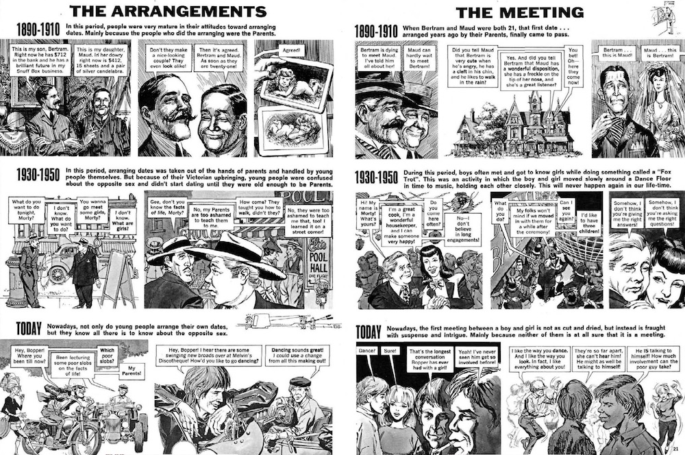
George Woodbridge’s art subtly changes to depict the different eras. The oldest era looks more like etchings, while the more modern eras are in his usual style. But remember how I said that this article could have been trimmed? That’s because the final two pages are about “Dating in the Future,” which is amusing — and not entirely inaccurate — but is somewhat sunk by Woodbridge’s strange decision to move to yet another style, this one weirdly cartoony in a way that doesn’t mesh at all with the rest of the piece:
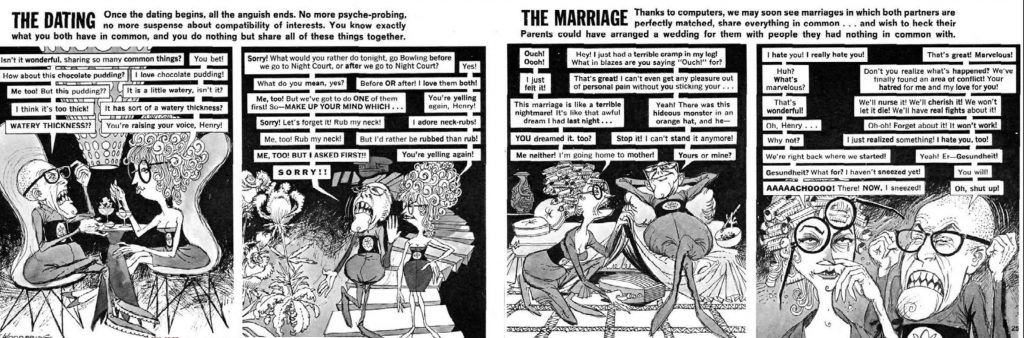
While I normally love Woodbridge’s art, in this section of the article, it becomes ugly and off-putting. It doesn’t help that the premise has worn out its welcome by the sixth and seventh pages, either. I think if I had been editing this one, I would have lopped off the final two and given Sergio Aragonés a couple pages, as he only appears in the margins of MAD #115.
“Protest Buttons” Through History: One thing I love about reading old MAD magazines is seeing what fads stuck around and which ones disappeared. Stan Hart and Bob Clarke’s piece looks at the then-new concept of amusing “Protest Buttons,” as they call them — buttons with a pithy one-liner. Again, this is a little filler-y, but it should be commended for Clarke’s panorama across the bottom of the pages. And I do have to say, I laughed at “The Marquis De Sade Really Knows How to Hurt a Guy.” (I’m less thrilled with the gay joke about Billy the Kid, though.)

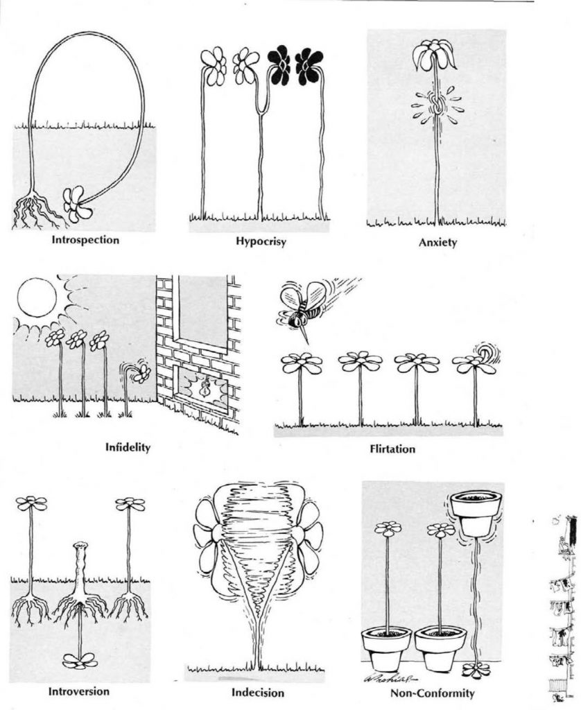
A Portfolio of MAD Blooming-Idiosyncrasies: While we don’t get any Spy Vs. Spy in this issue, Antonio Prohias makes a welcome appearance in one of his few non-Spy articles. Like Aragonés, Prohias is a master of pantomime comedy, and I’ve always loved this piece. It’s a simple premise, depicting flowers with the various neuroses of modern man. Prohias’ art is as vibrant as it always is, and while there’s not a lot to say, it’s a classic MAD piece.
Prodigy: Entertainment for the Gifted Child: One of MAD‘s beloved magazine parodies. While “Prodigy” is filled with great gags from Stan Hart and art by Joe Orlando, it seems like an odd target. I’m not sure if there was a rash of child prodigies in 1967, but at least Hart and Orlando are here to take those smart kids down a peg!
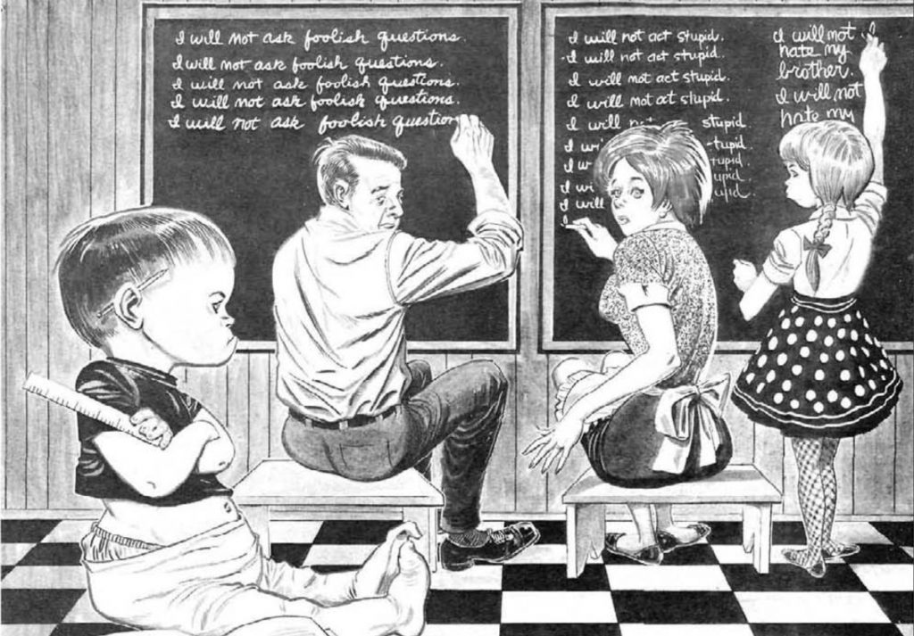
I gather this may have been a piece where it was pitched, and Hart then realized he perhaps didn’t have enough material to fill five pages. There are a lot of variations on the same gag — namely that the kid is smarter than their already genius-level parents — but the variations are still amusing. And, too, Hart gets into the resentment that parents may feel towards a gifted child when precociousness curdles into arrogance. (MST3K fans might get a chuckle from a throwaway gag — “For example, there’s Marvin’s older sister — a ten-year-old with an I.Q. of 148. Recently, we’ve begun calling her “Big Stupid.”)
The Lighter Side of Young Marrieds: This is a pretty average installment of Dave Berg’s recurring feature, but there are a few gags I particularly like. For example, this gag which (lightly) pushes back about the idea of women having to give up their careers to work in the home:
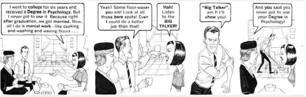
“The Lighter Side” is never particularly revolutionary — and even this gag doesn’t really condemn the practice of forcing women out of the workforce, but this is about as edgy as Dave Berg got, so I’ll take it. I’ve always been fond of “The Lighter Side” even if it’s always been one of the more creaky features of MAD. Berg’s always been an outstanding draftsman, though, and sometimes it’s enough to look at his great art coupled with amusing-enough jokes.
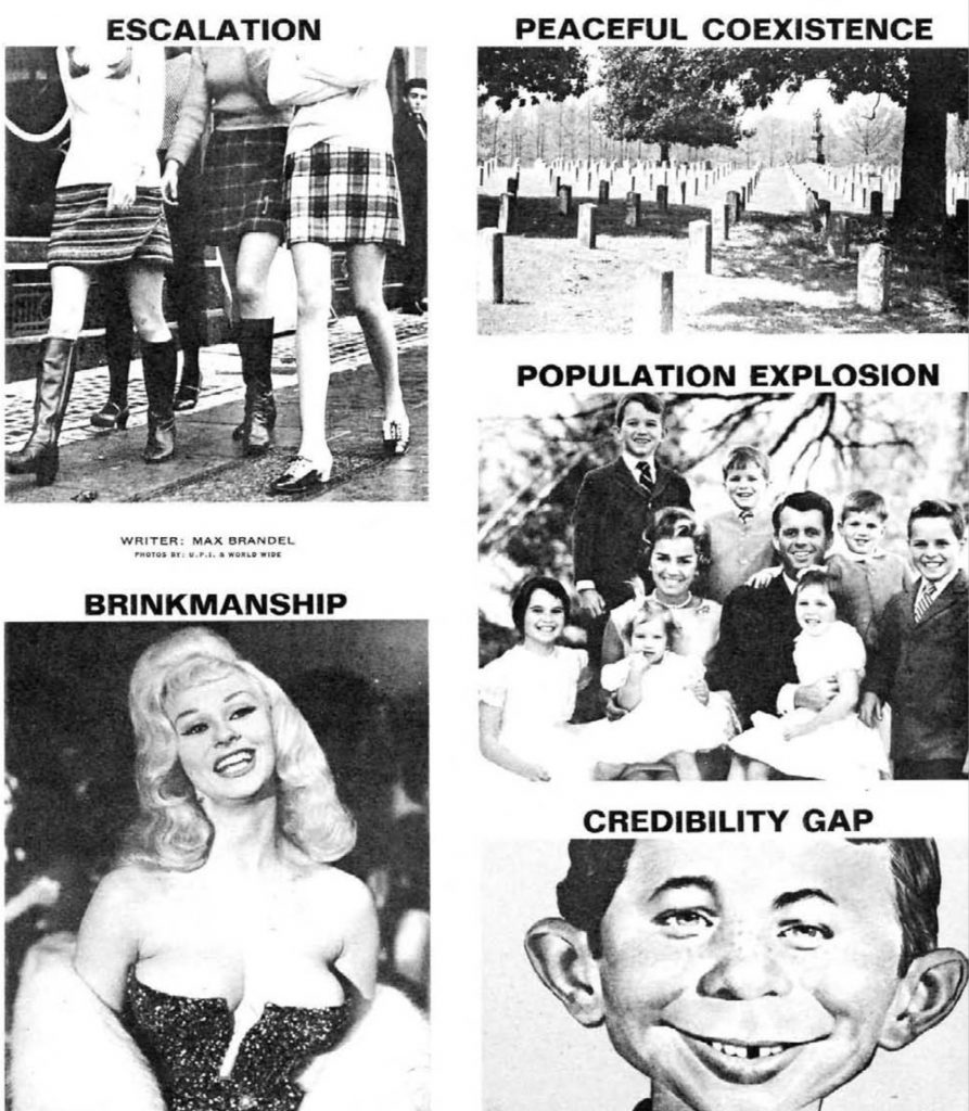
MAD‘s Pictorial Political Dictionary: In the piece about the National Lampoon MAD parody, I praised Max Brandel’s photo essays. Sadly, uh, this ain’t it. A collection of simple gags, none of them are terribly insightful, which is a disappointment, given Brandel’s “America the Beautiful — Revisited” from two issues prior that caused such controversy on MAD #115’s letters page. It’s downright lazy, which is shocking given Brandel’s immense talent. I guess everybody has an off day now and then.
Grim Pix: And we hit the second DeBartolo/Drucker collaboration of the issue, the parody of the now nearly-forgotten film Grand Prix. While Grand Prix didn’t stay in the cultural consciousness, it does make sense why MAD would parody it — the film was directed by the great John Frankenheimer and starred James Garner and Eva-Marie Saint. Unlike Star Trek, though, I’m completely unfamiliar with the “Grim Pix” source material.
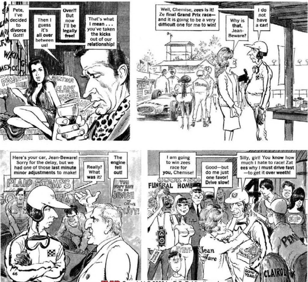
Of course, that doesn’t matter, as the best MAD spoofs don’t require you to have seen the movie. “Grim Pix” is, again, loaded with great gags. I particularly love how, as the story progresses, Mort Drucker ads more and more racing-style brand sponsorships on nearly everything. While I still don’t really care much about seeing Grand Prix, “Grim Pix” is a funny, engaging spoof and another highlight for DeBartolo who is, to use an apt idiom, firing on all cylinders in this issue.
MAD’s Modern Believe It or Nuts!: Sadly, while Dick DeBartolo’s having a strong issue, Bob Clarke’s not so much. It’s not Clarke’s fault; his art is great as always, but his pieces this issue all reek of filler. A one-pager that ends the issue’s interiors, Arnie Kogen’s take on the MAD recurring feature is weak. Some of it is due to sexist jokes that are incredibly dated now — how dare Kogen not write for the sensibilities of comic readers 50 years in the future! — but even the jokes that aren’t dated just fall flat.
The alligator is cute, though.
MAD Fold-In: The Fold-In is still relatively new, and Al Jaffee hadn’t put in the detail of his later works, so the gag is pretty easy to guess just from the unfolded image. Still, even Jaffee’s weaker Fold-Ins are still great and clever, and it feels unfair to blame him that a Fold-In from the first few years of the feature doesn’t compare with ones made after he’d perfected the format after 20 years. But I’ve always loved Jaffee’s paintings, and while not as complex as his later stuff, it’s still great
to look at.
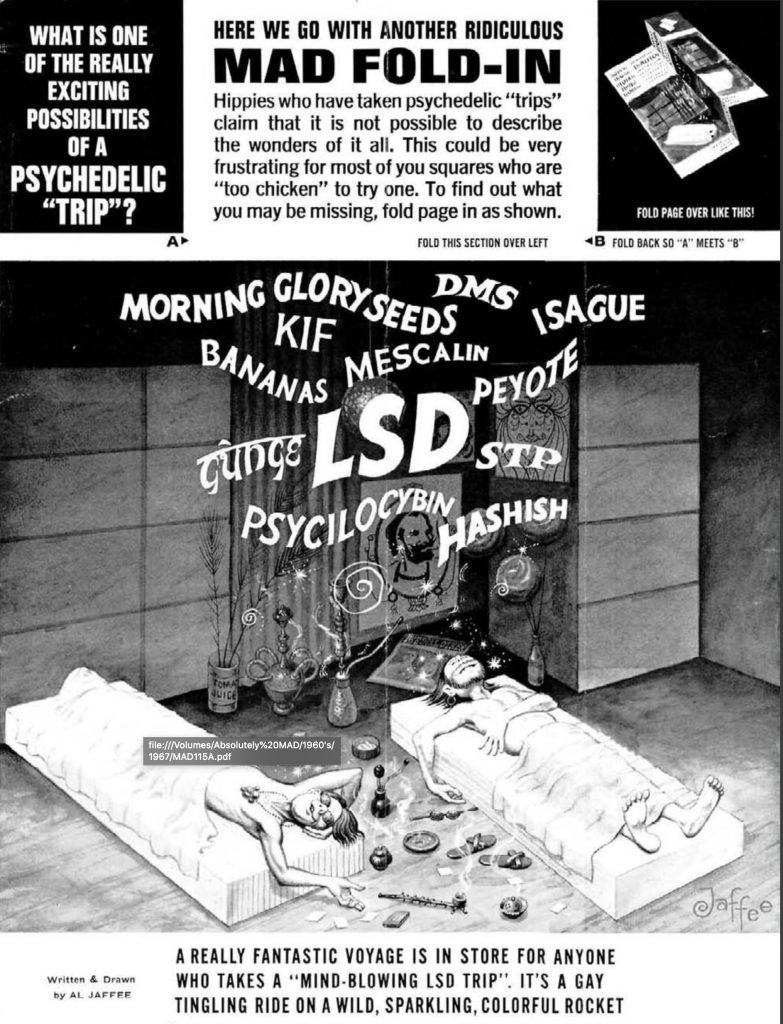
I’m also amused by the slang terms that apparently didn’t stick around, like “Isague” and “Gunge,” neither of which I’ve heard of in the context of drugs.
Finster Glints Ad: And finally, we reach the end, with a ad parody of… well, okay, I don’t know what the original ad was, and Google’s coming up empty. I think this piece would land better if I knew what the original ad was, though I can get the general gist.
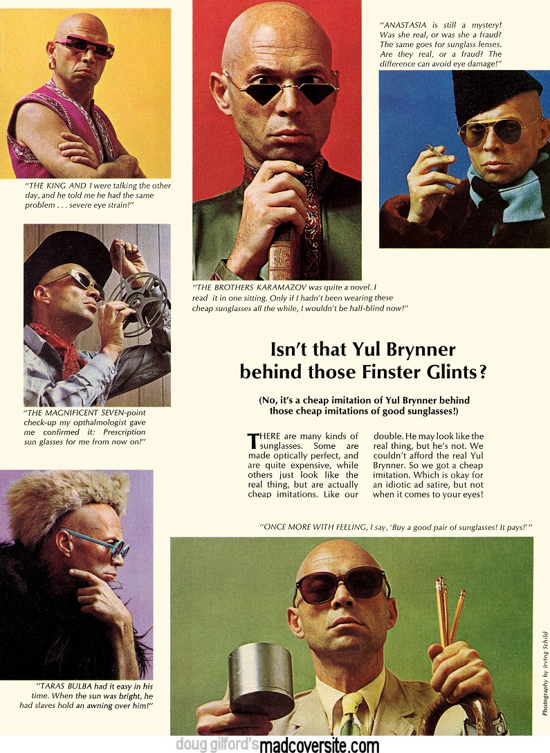
I imagine the original ad was simply a fashion shoot of Yul Brynner in various sunglasses from, uh, whatever company hired him to model sunglasses. (Seriously, I have no idea what the original brand was.) Without the context, though, it’s a little weird since I’m not sure how cheap sunglasses would cause eye strain, since they’re just colored lenses. But maybe I’m just being naive and 1967 was awash in cases of sunglass-induced blindness.
Update: Charlie Kadau pointed out the original campaign — they were for Foster Grants. He attached an example of the real ad:

Kittysneezes is supported by readers like you. If you enjoy what you’ve read here, please consider supporting us on Patreon, on Ko-Fi or via the Kittysneezes Boutique. And remember to check out our brand new podcast, Rite Gud!