We’re doing something different with the MAD review segment. Rather than going in order, we’re letting a trusty Random Number Generator pick which issue out of the 556 (to date) that exist. This time, the robots have chosen to look at what was going on in June 1996 with MAD #346. (And, since there are so many more articles, unlike in the comic book issues from #1 to #4, we won’t be going in-depth on EVERY article.) If you’d like to read along, it’s available for $2 via Magzter.
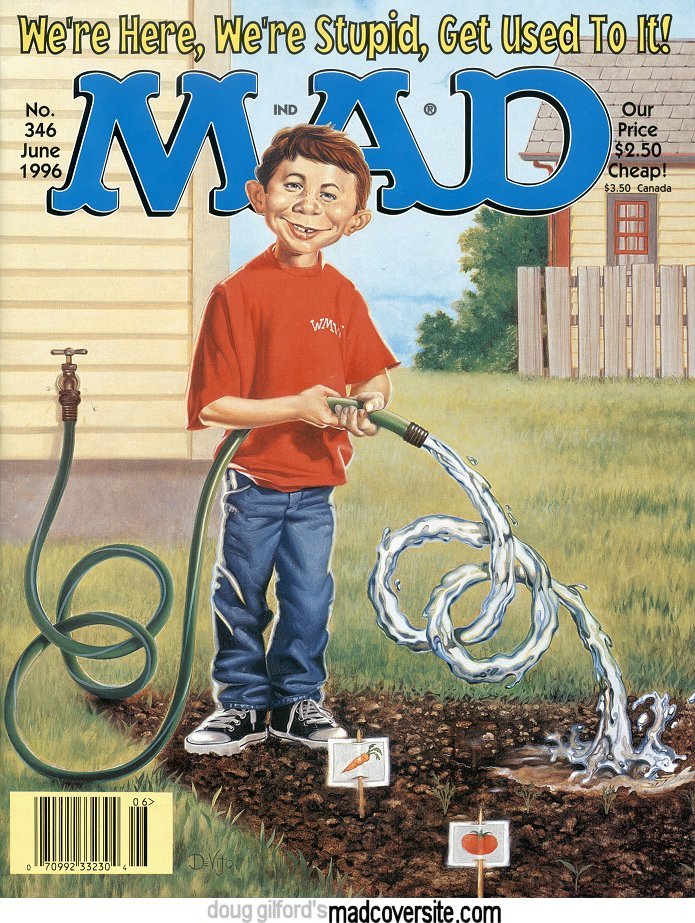
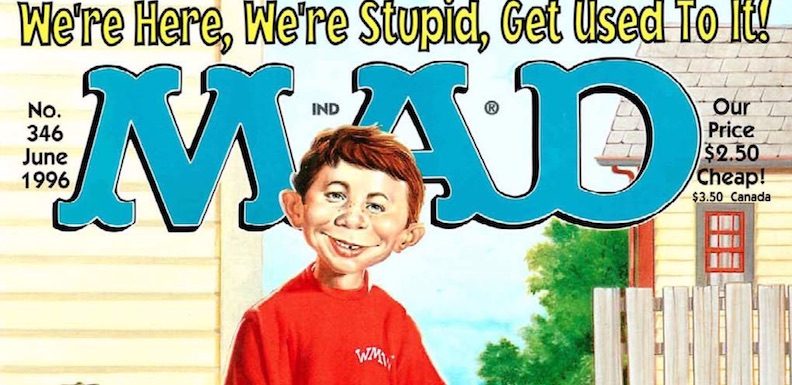
First, let’s start with the cover of MAD #346. You can’t see the gag in the cropped version above, so I’ve reproduced it here. As MAD went on, there was a move away from these sorts of simple gag covers that don’t have anything to do with the parodies inside. Unlike other covers of this era, the call-to-action text doesn’t even mention the contents. The gag, written by Michael Gallagher and painted by Joe Devito, is a simple joke, but it’s a funny one. Devito’s art is great too — the rendering of the water is particularly intriguing to me, and reminds me of the cover of Slow Motion by the band Man, which we’ll talk about at a later date, given the MAD connection.
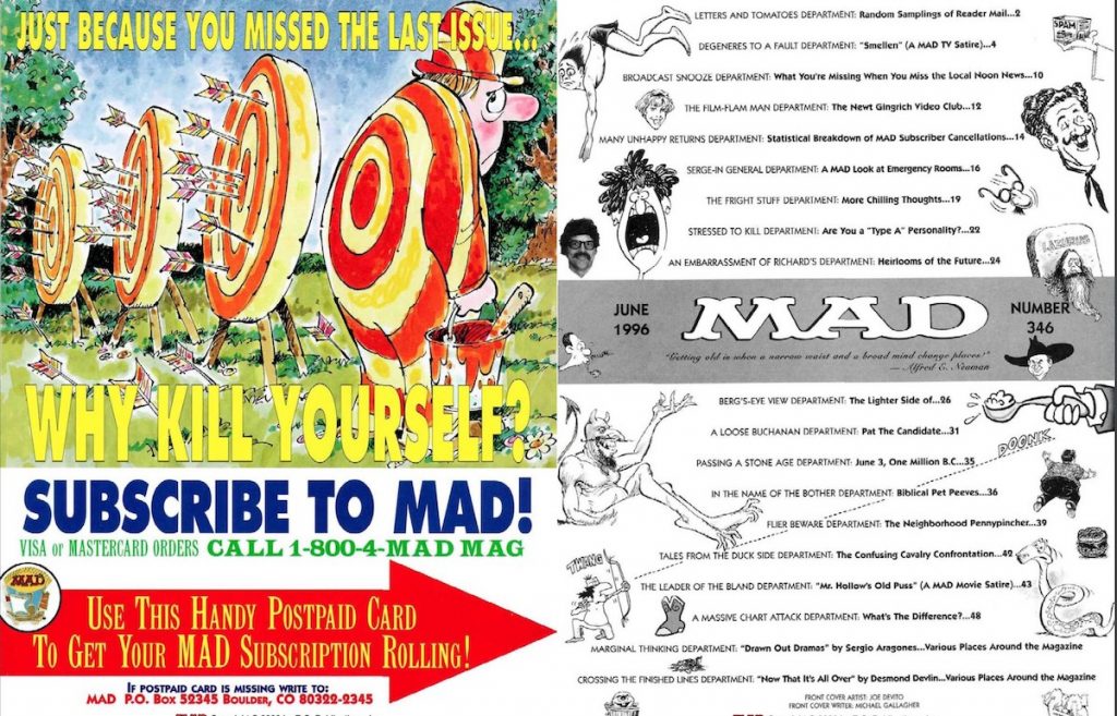
The ’90s was a weird time for MAD. Publisher Bill Gaines had died a few years before, and after his death, the editors experimented more while trying to keep the magazine true to what it had been. The inside front cover spread illustrates that quite nicely. On the left, we’ve got a subscription ad — a repurposing of the “Why Kill Yourself?” subscription campaign of the 1970s. But on the right, we see one of the re-designs of the contents page, which had recently changed from the familiar format MAD had used (with minor tweaks) since the 1950s.
Next, of course, is the Letters page, and then into the first article of the issue. While most issues start with the movie parody and end with the TV spoof, MAD #346 flips the two. This certainly wasn’t unheard of, especially as, in this case, I believe the subject of the TV spoof was more popular — namely, Ellen DeGeneres’ sitcom Ellen.
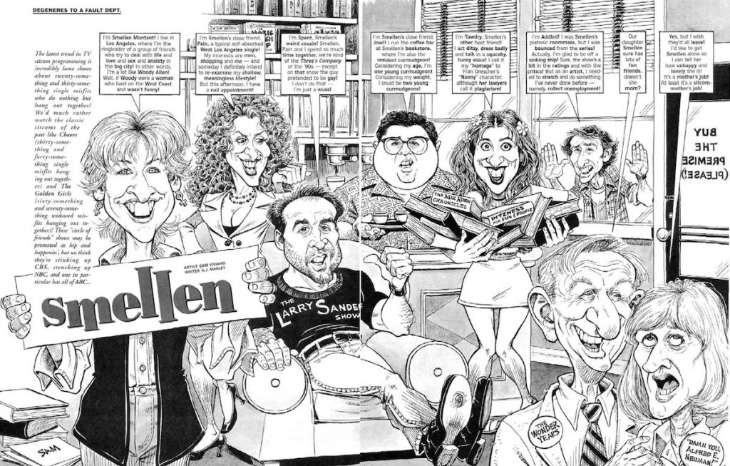
Smellen: Nowadays, Ellen is remembered mostly for the famous episode where Ellen came out and the backlash from conservatives. But that happened in 1998 — two years after this issue of MAD. Before that, Ellen was popular, but often criticised for being a cash-in on shows like Friends. (Fun Fact: Ellen was originally called These Friends of Mine — though, to be fair, it premiered about six months before Friends.) That’s the tack “Smellen” takes — calling the show out for being derivative. Though I haven’t watched it in ages, the pre-coming out seasons of Ellen were derivative, though, so it’s a fair cop. Ellen wasn’t terrible — it was just generic. (Or, as MAD called it, a “Pretty Mediocre Sitcom.”) That said, it’s an all-right parody; some of the jokes don’t really hold up, but, then again, it’s a 23-year-old parody of a 23-year-old show. Viviano’s art is, as always, great, but, truthfully, the parody is fine-but-forgettable, just like the source material.
What You’re Missing When You Miss the Local Noon News: a two-pager by the always welcome John Caldwell. It’s a fun piece about how TV stations moving to more news programming in the wake of 24-hour cable news means way more filler.
The Newt Gingrich Video Club: Another two-pager, this one by the recently-deceased Barry Liebmann and the brilliant artist Drew Friedman. It’s riffing on the comments by then-Speaker of the House, Newt Gingrich, about how the film Boys Town (about a home for poor and delinquent boys — basically an orphanage) was a good solution for broken families. The article takes the premise and runs with it, positing The Wizard of Oz as pro-capital punishment, and Soylent Green being an answer to the Social Security crisis. This one still holds up, even if Newt himself is (thankfully) mostly forgotten.
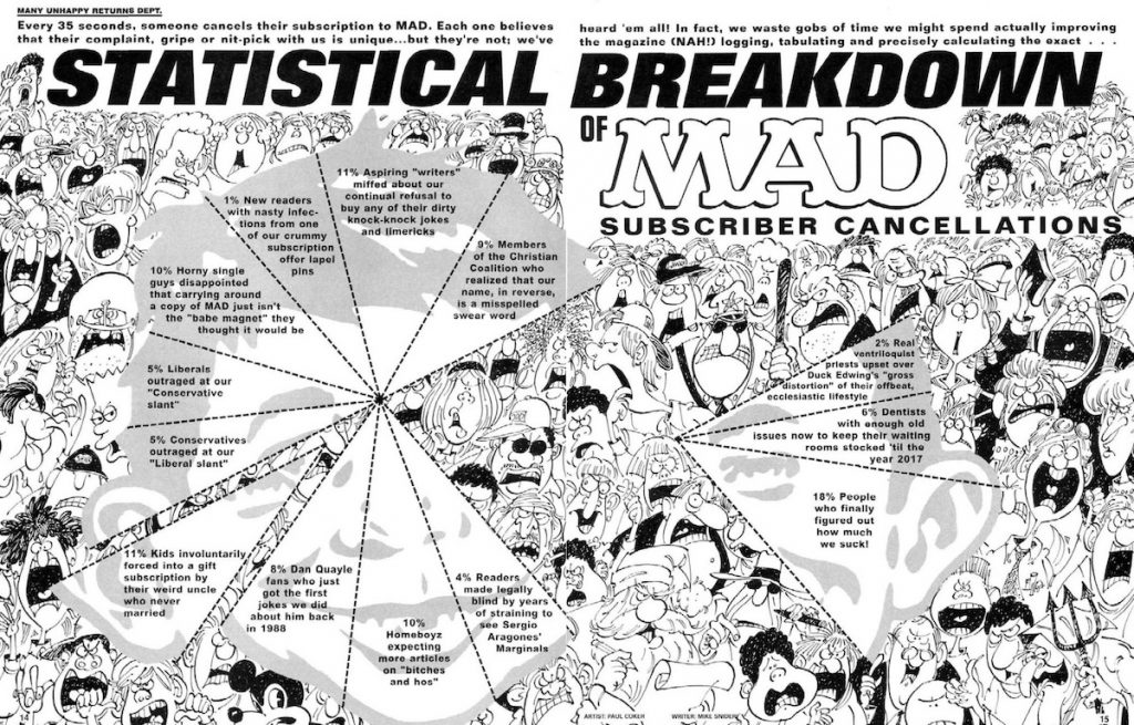
Statistical Breakdown of MAD Subscriber Cancellations: I kind of love this one. I’ve always been a fan of Mike Snider’s articles, and Paul Coker’s artwork is outstanding as always. The use of “chicken fat” is one of the keys to success of MAD, no matter the era, and I love these massive spreads like this where your eye can just get lost.
A MAD Look at Emergency Rooms: Every issue since the early 60s has featured a piece by cartooning legend Sergio Aragonés, and the world is better for it. Aragonés is an utterly phenomenal cartoonist, and his nearly-wordless cartoons are one of the things I look forward to most in any issue of MAD. This article is much like the rest of his MAD Looks, which is to say, hilarious and lovely. Aragonés is fundamentally unable to do not only bad work, but mediocre work. This is a gem.
More Chilling Thoughts: Though I often like Desmond Devlin’s writing, this one is a bit weak. There’s some good jokes, of course, but most of them feel like they’d be at home in late-night monologues of the time. Rick Tulka’s art is good as always, even if it’s not a exemplary exhibit of his work. It’s fine.
Are You a Type A Personality?: Two Desmond Devlin pieces back to back — and this one is much stronger. It’s just a fun look at the highest-strung people, and it’s always nice to see Bob Clarke’s art. Clarke’s an unsung hero of MAD, and after Antonio Prohias’ retirement, took over the art duties for “Spy Vs. Spy.” Though in this era, Spy Vs. Spy was illustrated by Dave Manak. Why am I mentioning this here? Because, shockingly in this issue and the next, there is no “Spy Vs. Spy” strip. I know, right? I don’t know why — just that it’s missing. And I miss it. Come back, Spies! Come back!
Heirlooms of the Future: James Warhola didn’t contribute to every issue of MAD, but it was always a treat when he did. (And yes, he’s related to Andy Warhol.) That said, this Dick DeBartolo-penned piece is a little cliché — mostly just gags about then-current trends. I love DeBartolo’s work, but this is a filler piece through-and-through.
The Lighter Side Of…: We might be missing a “Spy Vs. Spy,” but at least we’ve got Dave Berg’s long-running feature. I know folks gave Berg a lot of crap for his outdated style, but I’ve always been a fan. Not only was he a great artist, his jokes, ancient though they may be, are cozy. That said, this is a perfectly average example of “The Lighter Side,” but by this time in his career, this is standard for Berg. He wasn’t knocking them out of the park, but he wasn’t phoning it in either. Reading a ’90s “Lighter Side” is like checking in with your grandpa for five pages, and that’s not necessarily a bad thing.
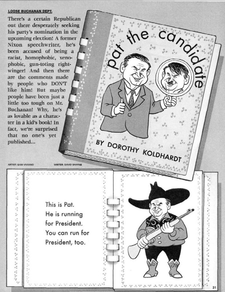
Pat the Candidate: I was not expecting to like this one as much as I did. The piece, a parody of both the children’s book Pat the Bunny and the hard-right candidate Pat Buchanan. Maybe it’s that Buchanan’s still semi-active in politics, but mostly, I love how few punches David Shayne pulls in his text. Shayne outright calls Buchanan a Nazi-sympathizer — and there’s even a joke about building a wall between the U.S. and Mexico. Sadly, some jokes never get old. No matter how much we’d like them to. Sam Viviano’s art is well-done as usual, too. This is my favorite piece of the issue.
June 3, One Million B.C.: It’s a wordless one-page strip by Dan Collins and Jack Davis. The joke — about a caveman inventing the toilet seat — is kind of “eh,” but any excuse to see Jack Davis’ art is a good one.
Biblical Pet Peeves: There are a few things that make MAD #346 a bit of an outlier. The lack of a “Spy Vs. Spy,” Duck Edwing only getting one page, and this article being Mort Drucker’s only appearance. Particularly surprising is that this is the type of piece that George Woodbridge would usually do, but he’s nowhere to be found. Another Barry Liebmann piece, it’s all right, but not as biting as “The Newt Gingrich Video Club.” Drucker’s art is outstanding as always, but, like with the Jack Davis piece on the previous page, it doesn’t feel worthy of his talents. (I do like the Job joke, though.)
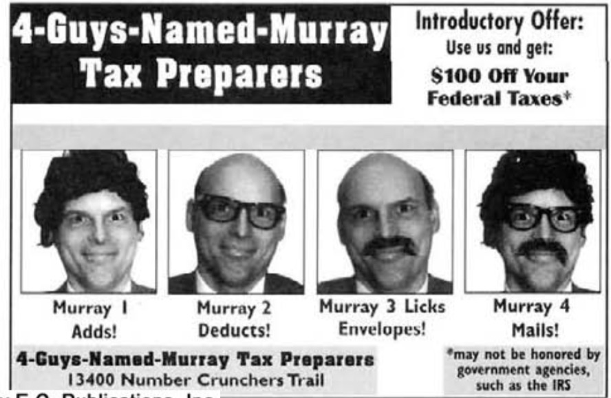
The Neighborhood Penny-Pincher: I’m not really sure if Pennysaver newspapers exist anymore — but if they don’t, they were short newspapers, mostly full of coupons and ads — sort of somewhere between a newspaper and a flyer. Written by Mike Snider and illustrated by Steve Smallwood, it’s got some good gags. MAD often would do stories like this about small, disreputable businesses, and this fits in nicely in that tradition. And, “Four-Guys-Named-Murray Tax Preparers” amused me more than is reasonable. They divvy up the work! One licks envelopes! One mails it out! I don’t know what to tell you, I just like this one.
The Confusing Cavalry Confrontation: Don “Duck” Edwing usually got three pages, much like Don Martin did before he quit MAD in 1988. But for some reason, he only got one in MAD #346. (Duck also typically wrote the post-Prohias “Spy Vs. Spy,” so perhaps he was under the weather when the deadline for the issue came around.) Still, though the joke may not fly now — it’s a “Cavalry vs. Indians” joke — it made me laugh to see the Cavalryman with a rifle embedded in his chest.
Mr. Hollow’s Old Puss: I’ve never seen Mr. Holland’s Opus, the film this is a spoof of. But MAD‘s movie parodies often act as Cliff Notes of the actual film, and this one is no exception. Written and illustrated by two MAD stalwarts, Stan Hart and Angelo Torres respectively, it’s amusing, even if it makes me think I’m not missing out by not having seen the film. The MAD spoof makes it look like a music-themed Forrest Gump of sorts, and, well, the real Forrest Gump was enough for me, thanks.
What’s the Difference: A rare Mark Evanier credit in MAD. (He only has one other one, an idea credit on A MAD Look at Cars by his friend Sergio — though he did write MAD Art, the outstanding resource book about MAD‘s illustrious illustrators.) A grid of gags, it’s funny, even if Evanier goes for low-hanging fruit with jokes about Rush Limbaugh and Bill Clinton’s weight and Madonna’s active sex life.
MAD Fold-In: Al Jaffee’s only appearance in MAD #346, but it’s a good one. The central gag of the Fold-In is about how people graduating from college will mostly just be saddled with a lifetime of paying off their student loans. Good thing spiralling student debt isn’t a problem anymore! We sure did fix things in the following 23 years!
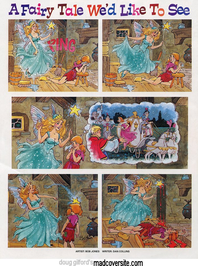
A Fairy Tale We’d Like to See: Dan Collins’ two writing credits are in MAD #346 — this piece and “June 3, One Million B.C.” They paired him with great artists, though — Jack Davis in that piece and Bob Jones in this one. I like this one better than “June 3,” though, even though I think the gag itself might be recycled from an earlier “…We’d Like to See” piece. This isn’t Jones’ best art, sadly — the layout is a little stiff, particularly in the penultimate panel. But it’s an amusing enough gag, even if the blood seems a little much.
Overall, MAD #346 is a pretty good issue. Not the strongest, but for an issue without really huge TV and movie parodies, not bad – and there are a few definite highlights.
Kittysneezes is supported by readers like you.
buy valtrex generic buy valtrex online generic
If you enjoy what you’ve read here, please consider supporting us on Patreon or on Ko-Fi.