John Glenn Taylor’s excellent blog, Easily Mused posted the entire 1971 National Lampoon MAD parody. Like a lot of National Lampoon it combines the brilliant with the pointlessly vulgar, but in this article, the hit-to-miss ratio is quite good.
The gist of it is that MAD skews too young and is too toothless — which I’m not sure if I entirely agree. MAD does skew a little younger than National Lampoon did— which isn’t to say that only kids read MAD, but rather that it opened itself up to everyone, where the Lampoon was obviously adults-only.
I’m a MAD collector (as well as a humor junkie), so I suppose my allegiances align more with MAD, particularly the era the Lampoon is, um, lampooning — which is my favorite era of the magazine. In my eyes, MAD‘s greatest period was from about ’68-’78, give or take, with special attention to ’69-’74. That said, the Lampoon parody is very well done, and, well, in some cases spot on. It helps that, like the best parodies, it comes from a place of love; almost everything about it is perfect in matching the style.
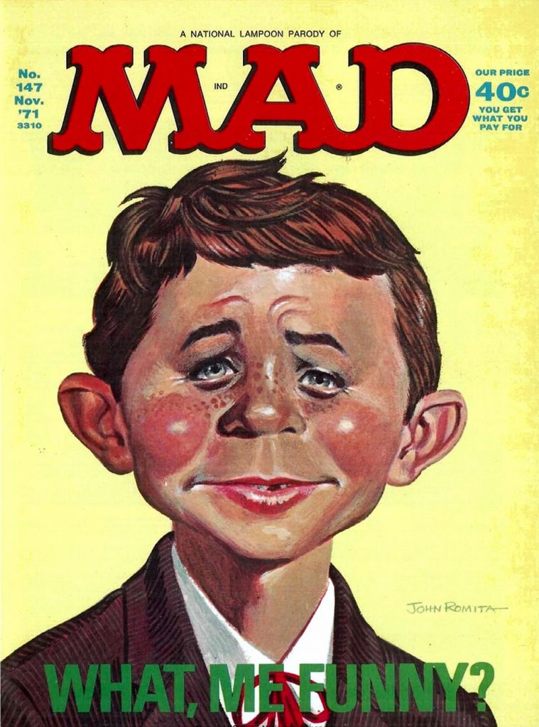
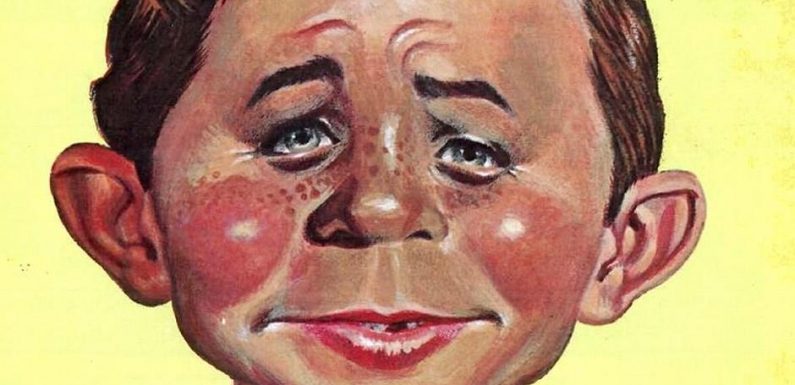
The Cover: This is quite good; John Romita does a great parody of the Norman Mingo classic Alfred E. Neuman painting. The layout of the cover is exact as well — including the “IND” in the logo (signifying the distributor of MAD) — and the “You Get What You Pay For” replacement for “Cheap!” is honestly something MAD should have used.
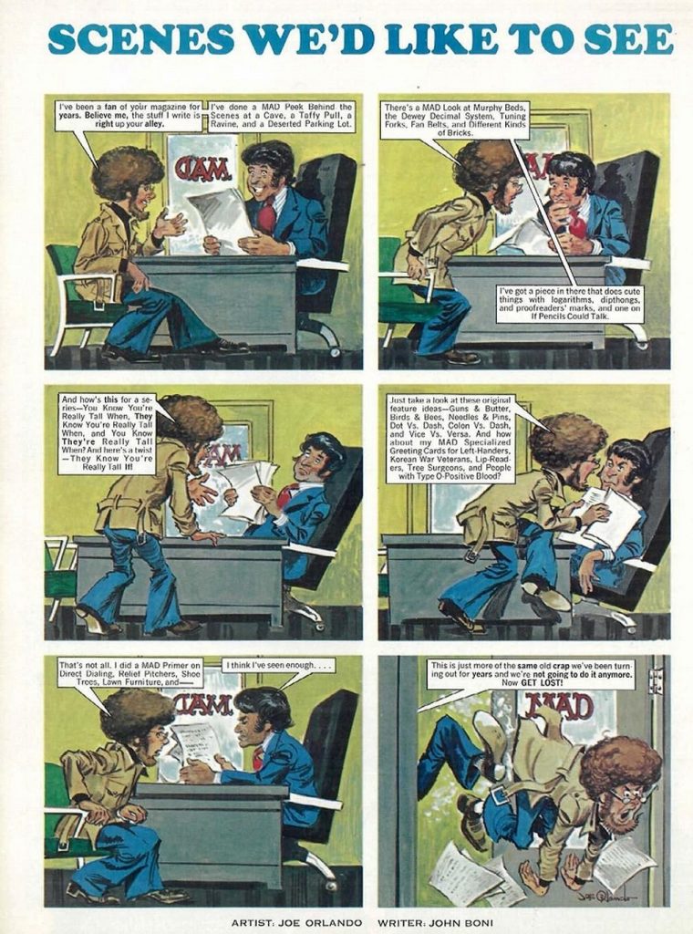
Scenes We’d Like To See: This one’s painted by Joe Orlando who was a MAD contributor for a long time, and after Bill Gaines died, up to Orlando’s death, was on the masthead as the associate publisher of MAD. John Boni, the writer, also contributed to MAD, though he wasn’t really one of the core Usual Gang of Idiots. This one pokes fun at MAD‘s tendency to do some rather formulaic articles; it’s a bit of a fair cop. A lot of the formulas were pretty good, though — but they ARE easy. I’m also wondering if the “GET LOST!” in the last panel is a reference to the Andru/Esposito short lived MAD knockoff of that name — one that Gaines actually sued as being too close to the original comic-era MAD. (As an aside, though it’s often thought of as one of the best knockoffs, having read the entire run through the recently published anthology book — it’s pretty dire. I tend to think that if it weren’t Andru/Esposito it’d be as forgotten as Eh! or, well, just about any of ’em.)
Table of Contents: The layout here is dead on, and there are some pretty good gags, too. The Don Martin Department listing of the generic titles he’d use for his strips; it’s not really a biting bit of satire, but it’s a funny joke. I also dig the “Borscht, Baby, Borscht Dept.” — a name I could see the real MAD using. Otherwise, there’s not too much to say.
Letters: Again, not a whole lot to say, but I do like the “Pasta” run of movie satire names. The Flowers For Algernon joke is amusing too, as is the Bifistula Ciliati letter. The Al Feldstein letter is interesting in that it does set the tone for the next article — it’s a little inside baseball (Feldstein was the editor since Harvey Kurtzman left in 1956, up through 1984), but folks who know MAD and comics history will get it. And, well, the content of the letter makes it pretty obvious who Feldstein is, even if you didn’t know.
Citizen Gaines: Ernie Colon does a pretty good Mort Drucker in this article. He doesn’t have Drucker’s gift for caricature — the Orson Welles in the last page doesn’t really look anything like him; I only figured how who it was supposed to be from the dialogue — but then, Drucker’s the best caricaturist who’s ever lived, so hey. Colon DOES do pretty recognizable drawings of the cartoonists — his Harvey Kurtzman is instantly recognizable, um, if you know what Kurtzman looked like, anyway.
The writing is pretty good — it mirrors some of the same rhythms of other movie satires, and unlike a LOT of MAD parodies, they get the bolding of the words right; so often when people joke about that, they just bold random words rather than the proper emphasis. One balloon that sticks out, though — a man labelled “Hi, I’m Max Brandel” says “Satire? I can’t conceive of such a thing”, which Brandel did some of the more brutal pieces of actual satire in the magazine — he was the creator of the image of a close-up on a hand making a peace sign with the fingers chopped off that ran on the back cover, and he also was behind the photo montages of the “… Revisited” series. Brandel was one of my favorite writers and one of the most poignant in MAD, so to saddle him with that line seems a little odd. (But in the same panel, I love the “Half man, half goat. Right?” line.) Finally — in the Declaration of Principles scene, it should be noted that Kurtzman’s era of MAD always had advertising in it; it was only after he left that MAD stopped taking ads.
The MAD Magazine Primer: Again, the art is quite good — Al Weiss does a pretty dead on Jack Davis. Writing-wise, though, it’s a little weak. The article just seems to stop. Again, the rhythm is right, but the article seems to be beating a dead horse, much like in “Chapter 3”. “Chapter 2” plays up the idea that MAD‘s toothless, and I think that’s one of the weaker arguments they have. While not every article was biting, of course, MAD typically didn’t shy away from that sorta thing, either. And, well, same could be said for National Lampoon, really. Like, I love Michael O’Donoghue’s article “The Churchill Wit,” but, well, it’s not exactly flipping off The Man. (But it IS hilarious. So go read it.)
Spy Vs. Spy: This one is pretty dang weak if’n you ask me. Babi Jery does pretty good with the art style, but that’s about it — and he’s not even as dead on as the other cartoonists. If you’re curious, the Morse Code is “Fuck All Gusanos”, “Gusano” being a derogatory term for someone who left Cuba as “Spy Vs. Spy” creator Antonio Prohias did. The point of this article just doesn’t seem to be there; the Black Spy is caught trying to capture the White Spy without a gun, but then it turns out he does have a gun and then convinces White to go and kill Che Guevara? Maybe I’m just dumb — but it doesn’t seem to be much more than bashing Prohias for leaving his post as Cuba’s biggest political cartoonist when Castro took over the newspapers… rather than likely being killed or imprisoned.
You Know You’ve Really Outgrown MAD When: John Lewis apes Jack Rickard almost perfectly in this one. The article, again, is in the vein of “MAD is for babies”, but it’s reasonably well done. Again, the rhythms of the article, the fonts, and the design are all exact. This one’s a bit of a filler article, but it’s the care taken to make sure it matches the original that makes it work as well as it does.
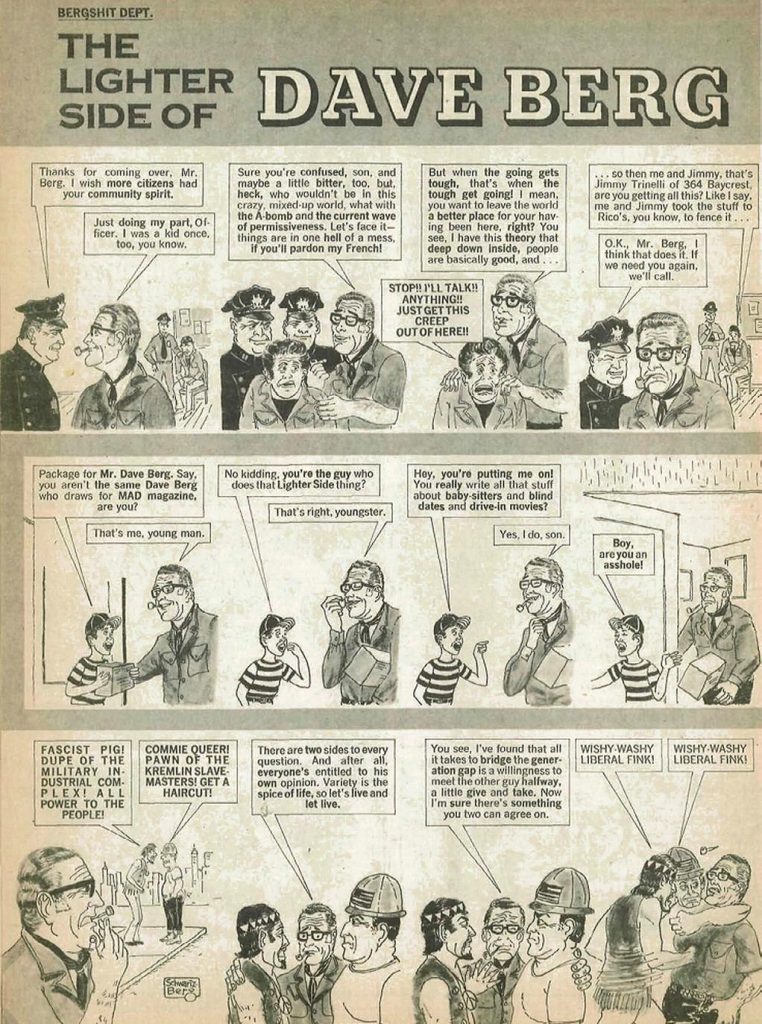
The Lighter Side Of Dave Berg: I really like this one — this is one of my favorite articles… and I always LIKED “The Lighter Side Of…”. Stuart Schwartzberg is pretty close — he’s not the outstanding draftsman that Berg was, but it’s a pretty good likeness. As far as the arguments about MAD being 15 years out of touch — this makes the best point for it. Dave Berg’s “Lighter Side”s always were pretty much taken from an older man’s point of view, and a combination of a sort of ’50s/early ’60s “Everything’s Hunky Dory” POV and old, corny jokes. I always did like Berg’s art, but he wasn’t really where you’d go for cutting edge humor — but I always found him kind of soothing. And, in the last strip, “Wishy-Washy Liberal Fink” seems like a fair enough assessment of “The Lighter Side”. (Also worth noting, Mark Evanier’s recounting of when someone recreated the second strip with the real Dave Berg…. who hadn’t read the Lampoon piece.)
Horrifying Clichés: Ralph Reese’s art is so perfect at first glance I thought they actually got Paul Coker, Jr. to parody his own creation. While you can guess the theme of the article and how it ties in with the rest of the parody, it’s one of the funniest bits, partly because the original was often one of the best recurring features due to Coker’s wonderful art. And seriously, “Blowing A JOKE” is just a hoot and a half.
One Day In The Park: Along with “Spy Vs. Spy”, this is the weakest part of the parody — and it’s also done by Babi Jery. The art doesn’t look like Don Martin’s at all, and the writing is just lame. The funniest thing in it is the department name: “Don Martin — Wasn’t He The Nutty Guy Who Drew All Those Crazy Cartoons That We Thought Were So Sick In The 50’s? Dept.”. Unfortunately, the strip is just awful. Yes, MAD frequently shied away from sex where violence was often OK; but so does the rest of American society. While that’s a valid criticism, it’s not something that’s explicitly tied to MAD, and the execution is incredibly poor. I’m not sure how one would accurately (and brutally) parody Don Martin’s style, but this isn’t it.
us overnight pharmacy pharmacy usa online generic
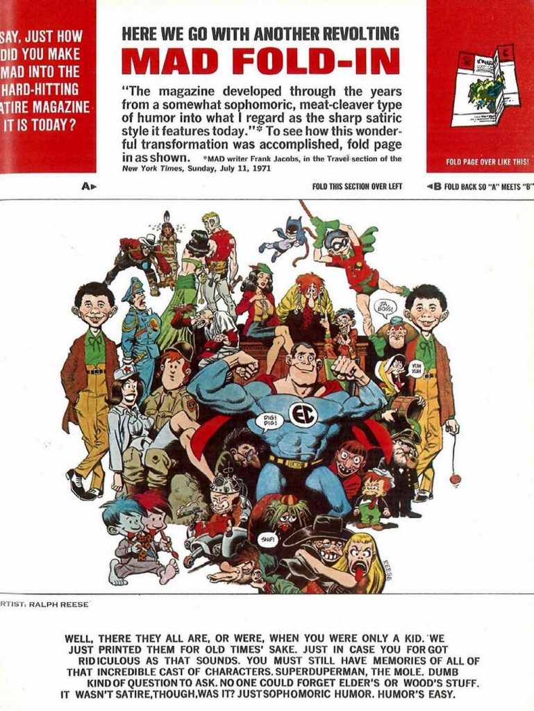
MAD Fold-In: Sadly, between this and the Don Martin parody, the MAD spoof ends on a down note. While Ralph Reese is an adept mimic (the parodies and cameos of characters from the first 23 issues of MAD are so well-rendered it almost looks like a collage), the actual fold-in part just seems phoned in; there’s no background, and you can tell at a glance what the punchline is going to be. Say what you will about the fold-ins, but Al Jaffee’s art is never obvious. The difference between the folded version and the unfolded version is always a surprise, and part of the fun is trying to find what it’ll be beforehand — and then seeing how the piece comes together once you DO fold it. This one is just easy and pathetic; even with the same punchline, the artwork could have had more punch. Whatever you think of the jokes in the Fold-In, you have to admire the ingenuity. That ingenuity is missing here.
While the MAD parody isn’t 100% solid through and through, it’s one of the best spoofs of MAD I have seen, and there are some really solid bits. It’s definitely worth reading for MAD fans and humor geeks… unlike most things that bear the National Lampoon name nowadays.
Kittysneezes is supported by readers like you. If you enjoy what you’ve read here, please consider supporting us on Patreon.
Previously published Jan 12, 2010.